
Tags
ClassicShell, Microsoft, Perfect at Infinity, Pixie Coffee Maker, Prodigio Coffee Maker, The humble papercllip, Windows 10
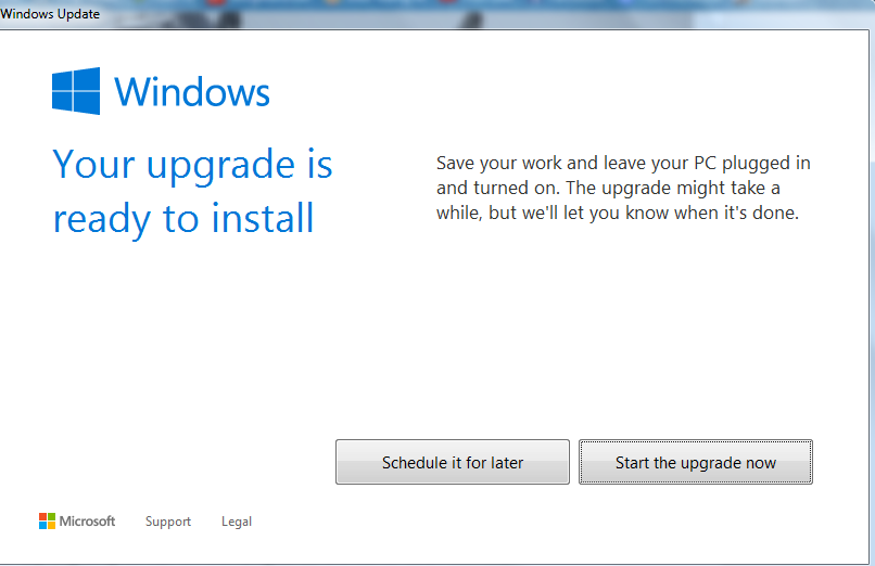 Note: no Close or Cancel option
I recently upgraded my laptop’s operating system from Windows 8.1 to Windows 10. Microsoft bullied me into doing it. For four months now, Microsoft has been bombarding me with invitations to upgrade and for four months I have declined the invitation. Finally, I had no choice. I could not remove the “Your upgrade is ready to install” pop-up and finally, I succumbed. I’ll come back to this in a minute.
I’m a reasonably heavy user of a laptop. In addition to all the usual stuff—web browsing, e-mail—I write and format e-books, paperbacks and blogs using elements of Microsoft Office. For this, I need a virtual desktop, proper keyboard and plentiful supply of AA batteries to feed my mouse. You can imagine my dismay therefore when Microsoft replaced the power-user-friendly Windows 7 with Windows 8 in late 2012. At the time, my ancient laptop had just died and I replaced it with a new Sony VAIO. The machine came with Windows 8 pre-installed and I hated it. Gone was the Start Menu and the familiar icon-based desktop had been replaced with tiles. Tiles! And those Charms never charmed me. I moaned and groaned for a week. Then I found a freebie application program called ClassicShell that restored the time-honoured functional desktop and Start Menu and life was wonderful again. I’d made my laptop look like a Windows 7 machine even though it was really running under Windows 8.
I wasn’t alone in my dislike for Windows 8. Windows 8.1, when it came, was Microsoft’s interim answer to the world’s collective moans and groans but although I upgraded to Windows 8.1, I kept ClassicShell and continued with my Windows 7 lookalike machine.
I understand why Microsoft did what they did with Windows 8. The company tried to create a user interface that suited both power users on laptops and lightweight users on smartphones and tablets—a universal interface that would look equally at home on a standard 15.5” laptop screen and, for example, the 5” screen of a Microsoft Lumia smartphone plus all smartphone/tablet screen sizes in-between. You must have noticed recently that many densely-populated websites, such as bank and social/news media sites, have been simplifying what’s displayed on the screen for the same reason. It’s the “one website page design fits all screen sizes” requirement.
Unfortunately, it doesn’t work except for all but the simplest activities. For example, there is no way I would try to write a book using a soft keyboard on a smartphone or tablet. Nor would I tuck my VAIO laptop in my back pocket in order to stay in touch with incoming e-mails while I’m out and about. It’s a horses for courses thing.
Back to Windows 10. As I said, Microsoft forced me to upgrade and with fear and trepidation in my heart and sweat on my brow I backed up all my folders and files, pushed the Start The Upgrade Now button and then retired for three hours while strange and wonderful things happened. I need not have worried. The upgrade went smoothly (including a smug “We’ve removed ClassicShell” message) and Windows 10 is fine. It looks just like Windows 7 with a few extra bells and whistles, most of which I don’t want or need: the Cortana voice recognition system (described as an “intelligent personal assistant and knowledge navigator”), and Edge, the dumbed down replacement for Internet Explorer. But, I like the new Task View option although I’m not so keen on the Settings interface. The default view is a skinny version of what used to be called Category in the Control Panel. The full-blown Control Panel is still there but you’ve got to search for it. (It’s in the Desktop folder.)
There’s a more fundamental problem however. Software is never finished. Feature creep is alive and well in software land. A company manufacturing a software product is constantly improving it: bug fixes and essential progressive features are obvious reasons but when you think about it, a software company has to bring out new versions just to generate revenue. Otherwise, how does the company stay in business? Through annual licence and maintenance fees, or pay-per-use fees? Sure, this will generate some revenue but not enough to stay in business and create new products. (I know. I’ve worked for and with software companies.) Consequently, a company like Microsoft has to keep on bringing out new versions of existing products, for which they can charge money, and this leads to what I call the “perfection at infinity” syndrome: a constant striving to improve a product that, for most users, is already close to perfection. Windows 7 was one such product, at least for me. Ballpoint pens, boxes of tissues, and paperclips are other such products. There aren’t many ways to improve a paperclip other than to change the material it’s made of—metal to plastic, for example—or change the colour, none of which improve the functionality of the clip.
 Another example of a product that is unnecessarily striving for perfection at infinity is the recently-announced smart Prodigio coffee machine, sold by the Nespresso coffee-capsule company for £159. We use Nespresso capsules and we have a regular £90 Pixie machine. You put water in the reservoir at the back, locate a capsule in the holder, place a cup underneath the coffee exit spout, push the button and lo and behold, a perfect cup of coffee. What more could I want? Plenty, according to the new smart Prodigio design. A Prodigio Bluetooth connection to an app on my smartphone means that I can now request a cup of coffee while sitting upstairs at my desk. Does it have a sensor to detect the presence or absence of a cup, I wonder, and who loads the capsule? I can also maintain stock control of my capsules (instead of looking in the drawer where I store them), and the app will inform me when some form of maintenance is due (such as it’s out of water or the spent capsule container is full or the machine needs descaling). Quite frankly, I don’t want any of these features. The Pixie does everything I want it to do. Once again, we see a product that is reaching for perfection when it is already perfect within the limits of mechanical engineering, frequent use, and user needs.
Perfection at infinity is a deadly goal. As consumers, we should take a stand and not be seduced by new features we neither asked for nor want to make use of. Innovation is good and keeps the wheels of capitalism turning but it should be tempered by what customers want and not by what product designers or marketing want in order to generate more revenue.
Consumers of the world, beware perfection at infinity and fight against unwanted feature creep!
 I used to be a penknife but I’m all grown up now.
(^_^)

Interesting read and I agree with you! I won’t even say what I usually say when you start complaining about your laptop! I like the idea of a coffee machine that can be activated from another room but as you say, who needs it. You’ve still got to get up and go and collect the coffee.
LikeLike